torsdag 19 november 2015

Reflections on the designprocess

During our presentation, we featured all the steps through our design-process.
We started off right from the beginning when defining our target-groups. Continuing forward towards doing our field-study with the method of using short interviews and a questionnaire that gathered qualitative data.  By then we had the main key takeaways when observing our target-group which were the following:
- generally negative to being interviewed
- they all own a smartphone
- positive to waiting for the next bus, if they knew it had more space
- negative attitude from other travelers towards our target-group
A short summary was made on when we used us by the method of creating personas and putting them into scenarios. The main conclusion was that we it helped us to think from a new perspective and also identify weak spots by asking ourselves the question, "What's their reaction and problems in the scenarios?".

Going back to our early sketches onward to the low-fi prototype to finally designing the hi-fi prototype, we could even more reflect on our process. We considered the process itself to be a short amount of time and we had quite a slow start. Brainstorming our ideas even further could've helped us as a group to find more motivations in our idea. When working on a target group based on the same amount of people as our own group, a lot of the work were based on assumptions about our target group.
So for starting prototyping our design, it's hard to imagine to do it any other way than we did. The peer-feedback gave us improvements on the small details on colors or symbols and not the general iterating throughout the application.
But using the evaluation methods we were given, such as doing a walkthrough, usability heuristics and  think-alouds ,  it became clear that improvements were made every time we iterated. And the more technology we implemented, we would've need to do another iteration and that feedback would've been even more valuable for our product. This was the most important key takeaway for our group from our process.

The development of our design process:


onsdag 18 november 2015

Personal reflections on the design and designprocess

We did 3 prototypes (with 1 being just a sketch on paper) but I feel we could have done much more.
Our first page on the app was one of the last things we put in the last prototype but felt extremely logical when we had a clear thought behind it; this could just be a part of a larger system, which means we could had iterated a lot more. Thoughts of a "front page" had came up before but felt unnecessary until we had a goal behind it.
The design part of the course was kinda fast, we only had time for 2 rounds of a iterative process. Although the prototyping itself was also a iterative process with adding, removing and redesigning between the group.
We got very useful feedback from the other group in the feedback exercise (they did a heuristic evaluation of our prototype) and our think-alouds (I noticed a problem the second my person opened the app, something I hadn't even thought about) which just shows what I wrote before, we could had iterated a lot more. But then again, when is it really done?


Final Hi-fi prototype

For Exercise #6 we finally presented our work and resulted in this final step, the final design of our group's High-Fidelity prototype:

Our 1st frame:

When in use:


Help Information:


If the user would be colorblind, the mode for colorblind can be switched where help can be found and would use text to indicate the information, as following:


onsdag 11 november 2015

Summarize of the group's Think-Aloud


From all our individual Think Aloud Evaluations we got the following notes:

  • Iterating through the app prototype were not intuitive; here is where an information button would be helpful. 
  • The color codes for the bus symbols were confusing, the one testing understood that it indicates something but does not understand for what
  • Pram symbols gave the indication we expected, which was whether there is space for the prams or not. But one thing lacking is how much space there is. Another thing we could clarify.
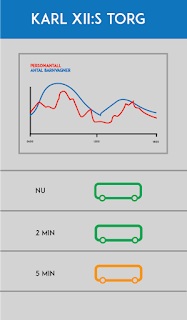
  • The real-time information was one thing working well. The participant understood the purpose at it's first glance but clicking for more information and see the graph of statistics could be more clarified as well. Using arrows are not informal enough.
The notes is very similar to the feedback we got from the evaluation during the last exercise. Our conclusion is that as our clickable prototype is quite concise in it's design and functionalities, that doing a think-aloud-evaluation would be more suitable for a prototype that includes more steps and maybe further functions to actually get an user-experience. But the purpose of the application was something the participants thought was well needed in today's commute traffic in Stockholm.

torsdag 5 november 2015

Feedback from exercise 5

From our exercise yesterday we got the following feedback:
  • Critical stops at the route, indicating the circulation of people and not just how many there are on the bus. People will also get off the bus leaving space.
  • More help support through the app, as iterating through the app is not as clear as expected.
  • Colour-blinded travelers should be considered when using color codes on the bus-icons, whether the bus is full or not.
  • Clarify the icons for the prams showing how many spots there are and available spots on the bus.
  • A suggestion of adding icons for information about the stops, for example if there's a park or area of cafés. That way, the functionality of the app also serve a better planning for the travelers by giving suggestion of what they could do if the upcoming buses is full and doesn't have any spots left for the prams.

This will be points to consider when modifying the design and the iteration process even more for the final presentation.

tisdag 3 november 2015

Hi-fi prototype


Today, we have been working on the first hi-fi prototype in Flinto. The slides are made in Illustrator and Photoshop. We started off by drawing the slides from the lo-fi in illustrator and then developed it with regard to the feedback we got from exercise 4. We added reverse buttons and made used grids make the design clearer. We also added a feature that tells the user how many strollers that are on that given bus. We use red, orange and green to communicate whether the bus is full, half full or almost empty, and the prams-icons lets the user know how many prams there are on the given bus. 


fredag 9 oktober 2015

Evaluation from another group

From the exercise 4 we also received an evaluation from another group. The feedback received was as following:

Focus group
- Apparent to who the target audience are. However, the target audience could also be for travelers with wheelchair.

Functionality
- Assuming the user will have a smart device.
- How many there are on the route real time information. One can view statistics over the general amount of travelers together with travelers with strollers.

"The Feeling"
- Users will return to the app.
- Different opinions in the group whether another step is needed or not
- Stops using the app when on the bus

Interaction & Over Arching Structure
- Reverse button from the Jarlaplan screen should be added.
- Information about how to use the app - help button/introduction
- Part of the already existing "Reseplaneraren"?

Primary & Secondary functions
- Clarify the "more information" screen
- Maybe add an alternate traveling route
- How many strollers/travelers
- The accessibility of the route

Design/Composition
- Placement about the information of the strollers should change place from the top to the bottom of the screen.
- Colours of the stroller icons is not intuitive, different patterns are not consistent
- It's not clear if one should swipe backwards
- Reverse + information button should be added
- Combine together with the app "Res i Stockholm"


Help
No, no help support is provided.

This will be notes to think about when having our next meeting to design the final Hi-Fi prototype.

torsdag 8 oktober 2015

Evaluation to group 3

User group
Is it clear to whom the service is made for?
The user group is clear. Flags are a good way of indicating that it is available in other languages.
Can also be used by others outside the user group.
Is the functionality well adjusted to the particular user group?
Clever solution. We like that the flags are on the main page. Not too much information on the main page. Main language could be English to clarify that the interface is directed towards tourists.
'The feeling'
What does the first impression tell?
Simple and clear. Minimalistic. The user's mission is to buy a ticket.
The zones are not clear. A? A+B? A+B+C? What does that mean? Is the 'Choose you zone?' function necessary? Maybe a tourist map instead of station map. The tourist could click where he wants to go and the interface could tell the user only the price. It is not necessary to know what zone you are in.

How are blind people going to interact with it?
Interaction and overarching structure
It the flow clear?
'Choose your ticket type'  in clear (good that the ages/limits are there!). The receipt is good, nice to get a confirmation that you have the correct tickets. Great that the app tells you is you have to change bus/tube. Good idea to print line switches on the ticket. The zone function is a bit unclear. Could the ticket be colour coded? This could be a good idea since the subway-lines already are color coded, by this you will create similarity in the design to group the interface with the existing subway map solution.  A suggestion: Minimize the user’s memory load, by always showing the steps and choices he has made.
Is it always clear what options and possibilities the interface provides?
We suggest that you instead of the stations map have an interactive tourist map where the users can click on for example 'Slottet'. That way it will be easier for the tourists to find their stop. Is there any solutions for error prevention? What happens if the user click on the wrong button.

Primary and secondary functions
Is the main functions in focus in the design?
Yes. The main action is to buy a ticket, and that is clear in the interface.
Is the secondary functions valuable?
No. We think that the 'zone' function could be swapped with a tourist map.
Design/composition
Is functions and elements naturally grouped? Design/layout?
The design is clear and easy to comprehend. It might be a good idea to colour code the buttons.
Recover from errors:
What happens if you want to change the trip in the last step. How does it work with the steps, will you have to re-do the steps if you go back or does the already tapped in information stay unchanged?

Sketches
Are they clear enough?
Yes. The prototype is well made and it is easy to understand your concept from the popApp.

onsdag 7 oktober 2015

Prototypes


Today we have been working on prototypes. We wanted to have a finished prototype for a heuristic evaluation at tomorrow's exercise.


tisdag 6 oktober 2015

First ideas

During and after the 2nd reading seminar, first ideas of the appearance and design of our first prototype started to come and we sketched the ideas briefly before we decided to have a long group meeting to properly design the prototype:


Seminar #2

Our project has allready done most of data-gathering and it's not time to analyse the data. To our help we have chapter 13 & 15 in the course book "Interaction Design - beyond human computer integration". Chapter 13 introduces the DECIDE framework, which will help us plan the evaluation of our product.

One of the points, the "C", stands for "Choose your approach and methods", where i think we got alot of planning to do. Since our target group is highly mobile we're not gonna be able to take them to an offsite location to evaluate our product. We're instead gonna have to find a way to follow them in an outdoor setting and still track their usage or our product.

We also gotta make sure to not change the people we are observings behavior. This is noted as a dilemma in the book, where some argue that it's almost impossible to study peoples behaviour without changing it. I think we mostly have to think about the fact that we might change the behaviour of the people we are evaluating, and therefore take extra precautions to make sure that we do everything we can not to.

Chapter 15 gives an alteranative to this, so called Heuristic Evaluation where we instead invite experts on the field (maybe ourselves) to examine the product against some heuristics (usability principles). The more experts you invite the better of a result you're gonna get.

I believe that our products success is gonna lie partly in how easy we make the HCI, but also in the actual idea itself. We have to first make sure that the product in its core brings value to users, without even thinking about the actually interact with the product. Then we will have to make the interaction as easy as possible. 

I see our product becoming very self aware, presenting info to the user without any input, and therefore most of our evaluation should be doable without the product avaliable. If the task is about informing users about how full the next bus is, this can be simulated by standing on different bus-stops around Stockholm and telling people about the next bus's capacity.

Reading seminar #2

In chapter 13 we are introduced to the evaluation framework DECIDE. This is a useuful checklist for when you are going to plan an evaluation study. DECIDE stands for:

Determine the goals
Explore the questions
Choose the evaluation methods
Identify the practical issues
Decide how to deal with the ethical issues
Evaluate, analyze, interpret and present the data

This is pretty straightforward and recognizable for everything planning. It doesn’t feel redundant though as it is important things to know. To know a goal and how to achieve it is something that always shows up in group work and is really important.

Choosing the evaluation methods are also important as the evaluation can’t be done if you have gathered the wrong data. Practical issues depend on the chosen methods as well and of course the type of product/service you are designing. Appropriate participants, facilities, equipments, scheduling and budget are other practical issues to think about. Pilot studies can help to spot different types of issues.

When evaluating/gathering data, ethical issues are important too, and for me is very important. Universities have their own boards for reviewing activities involving human studies (IRB, Institutional Review Board). The book has a list of important things to think about when doing studies on human to ensure they are done ethically and protect the user rights. Most of it is about being clear and true to the test users and let them know they can stop anytime, and of course to preserve anonymity. The last point on the list confused me though: ”Gain them trust by offering to give them a draft of the study … ”. That sounds a bit like you are going to lure them in to something, or like a dog. 

Evaluating, analyzing, interpreting and presenting the data are also covered in this chapters. Key points in this are reliability, validity, ecological validity, biases and scope. 


Chapter 15 also covers evaluations but focuses on methods, mainly inspections, analytics and models. Inspection methods include heuristic evaluation and walkthroughs. Analytics are a more quantitive evaluation methods which include logging the users interactions and handling large volumes of data, anonymized. Predictive models are used without users being present and is used to predict user performance.

Heuristic evaluation is a method where an expert ”role-plays” a user and follows a set of usability principles to identify usability problems. The first set of principles are still used but new technologies and different types of products has developed new sets of principles and new oens are always developed.
The expert should iterate many times to try to find all the usability problems. Still, most of the times all aren’t found. Many experts/evaluators can be hired but is more expensive. But the method requires no users or special facilities so it is cheaper in a way. General design guidelines can be very similar to heuristic principles, so designing for the heuristict principles can be a good idea.

Walkthroughs are simulating a users experience and is a method of finding usability problems by walking through the product step by step. Cognitive walkthrough is a simulation of a user, pluralistic is more of a team effort involving different types of people working together on a walkthrough. 

Analytics is a big part of the web nowadays and can be a useful evaluation method. It’s mostly just logging large volumes of data of the user interactions, anonymized and analyzed statistically. A very quantitive method. 

Predictive models are methods for predicting without the users being present. GOMS, KLM and Fitt’s Law are methods introduced in this chapter and can be used to predict the users performance.
GOMS stands for goals, operators, methods and selections rule. With this method you can follow the steps and get a rough cognitive model of the user. 
Fitt’s law is interesting as it is a mathematical formula for ”predicting the time it takes to reach a target using a pointing device”. In other words, how fast you can click something depending on how big it is, how far from your pointer and etc. 

All these methods are not set in stone and you can, and probably should, tailor them for the type of product/service you are designing.

Before seminar #2

Chapter 13 focuses on evaluation frameworks, and how to properly evaluate the design of your product in different stages of the development. The authors mentions how a final design often is the result of an interplay between several iterations of designs and evaluations. As the designers learn more about what works and what does not, the evaluations will in turn provide more meaningful data, giving the designers more to work with. There is a powerful synergy to this process which guides designers towards intuitive designs with a high level of usability.

One of these evaluation frameworks is the so called DECIDE framework, which contains six distinct items to work with before, during and after the evaluation. The DECIDE framework have a lot in common with the data gathering and data analysing techniques that we have discussed in the past, such as determining goals, choosing appropriate methods, identifying issues, how to deal with ethical questions and how to properly analyse and interpret the collected data.

A significant part of the chapter is devoted to explaining how to approach and treat the participants of an evaluation. The authors mention several important steps that should be considered, such as finding appropriate participants (i.e. the intended users of the final product) and to keep the participants involvement and data confidential. The authors stress the importance of confidentiality and that the scope of the evaluation process should be known to the participants beforehand.

Different kinds of biases are also discussed and how they can influence how the data is interpreted and distort the result of an evaluation. This ties in to an earlier part of the chapter where the authors present a concept called ecological validity, which describes the impact that the evaluation environment can have on the result. For example, an evaluation carried out in a laboratory might yield results with high validity in and of itself, but the participants will not necessarily act like they would naturally outside of the laboratory. I found this concept particularly interesting, and I hope we get to use it in our project.

The authors also mention budget and schedule constraints. Not much is said of how to deal with these constraint however, just that they exist and should be taken into account.

Chapter 15 continues on the topic of evaluation and presents another method called Heuristic evaluation. Instead of letting users participate in the evaluation, the product is instead evaluated by an expert with knowledge on good design and usability. The design is judged against a list of heuristics (usability principles) in an effort to identify usability problems and areas of improvement. More often than not, the heuristics in use have been developed specifically for the type of product being evaluated.

One of the key points of heuristic evaluation is that the end result becomes better the more evaluators you have. Together, the evaluators will pinpoint more design flaws and usability problems that one evaluator would have. This to me feels like another take on the concept of data triangulation mentioned earlier in the book, since different evaluators tend to focus on different flaws in the design.

The second part of chapter 15 focuses on walkthroughs, methods where the evaluator(s) go through a product design step-by-step, noting usability problems and areas of improvement along the way. The authors specifically mentions two variants of walkthroughs; the first one being cognitive walkthroughs that focuses on the user’s experience and thought processes. Here, the evaluator will often roleplay a first-time user and simulate the process of achieving a specific goal.


The other variant is called pluralistic walkthroughs and involves a group of evaluators making individual notes on the design, which they then share with each other and discuss before moving on. I found both these types of walkthroughs intriguing, and I can definitely see the benefits of applying them to our project at a later stage.

Question for the seminar: How do you tackle constraints that limit your ability to conduct evaluations?

Before Reading Seminar #2

For this seminar we read the chapters 13 and 15. Both of which contained theory about evaluating systems generally. Frameworks and methods are described.
In chapter 13 the main key point was the description of the DECIDE framework, listing six different steps when planning to do an evaluation study. In relation to our project the framework could be very suitable when starting to evaluating our first mockup.
As this will be the first experience of doing an evaluation study, the DECIDE framework is a great  model for us to start with. Similar issues from the previous chapters read in the previous seminar are brought up in these chapters, but in a context where the issues are put in practice. Though ethical issues aren’t as current seeing that we don’t use the private data and does not therefor need to be as much considered. However, other issues concerning the evaluation is higly important and the DECIDE framework is useful in that way whereas it gives a great overview of the many key points.

Chapter 15 included methods for an evaluation study, mainly the methods Heuristic Evaluation and Walkthroughs.
A Heuristic Evaluation is a method using a set of usability principles, the heuristics, to guide the inspectors doing the evaluations. The method Walkthroughs can be divided into two parts; cognitive and pluralistic. This method involve walking the inspectors through a task with the evaluated product.
The primary is that these methods don’t have to include the users, or more importantly, it doesn’t. Instead the methods are tools for understanding and getting the knowledge about the user’s behaviour and consequently finding the problem issues, fitting requirements or whether the functionality of a system serves the user or not. All by the use of so called experts & specialists that works as evaluators whose task is to examine the interface of an interactive product, often role-playing typical users, and suggest problems users would likely have when interacting with it(...)”.
An important note is that the evaluators can be several and the more evaluators, more accurate results will appear when finding the user’s issues.
Using methods that also doesn’t require involving users, fewer practical and ethical issues have to be considered.
I find the approach of the evaluation needs to be clearly set since a Heuristic evaluation compared to using Walkthroughs are good for different evaluations. A Heuristic evaluation is suitable when evaluating a complete system whereas a Walkthrough is suitable for evaluating a small part of a system.
These methods desribed should not be the primary methods, but instead it’s a good compliment to user testing when analyzing a system or a product.


My question for the 2nd reading seminar: As our group of a small amount of people that will maybe the most knowledgable of our system, what determine who should be the evaluators(experts) in our case scenario?