torsdag 19 november 2015

Reflections on the designprocess

During our presentation, we featured all the steps through our design-process.
We started off right from the beginning when defining our target-groups. Continuing forward towards doing our field-study with the method of using short interviews and a questionnaire that gathered qualitative data.  By then we had the main key takeaways when observing our target-group which were the following:
- generally negative to being interviewed
- they all own a smartphone
- positive to waiting for the next bus, if they knew it had more space
- negative attitude from other travelers towards our target-group
A short summary was made on when we used us by the method of creating personas and putting them into scenarios. The main conclusion was that we it helped us to think from a new perspective and also identify weak spots by asking ourselves the question, "What's their reaction and problems in the scenarios?".

Going back to our early sketches onward to the low-fi prototype to finally designing the hi-fi prototype, we could even more reflect on our process. We considered the process itself to be a short amount of time and we had quite a slow start. Brainstorming our ideas even further could've helped us as a group to find more motivations in our idea. When working on a target group based on the same amount of people as our own group, a lot of the work were based on assumptions about our target group.
So for starting prototyping our design, it's hard to imagine to do it any other way than we did. The peer-feedback gave us improvements on the small details on colors or symbols and not the general iterating throughout the application.
But using the evaluation methods we were given, such as doing a walkthrough, usability heuristics and  think-alouds ,  it became clear that improvements were made every time we iterated. And the more technology we implemented, we would've need to do another iteration and that feedback would've been even more valuable for our product. This was the most important key takeaway for our group from our process.

The development of our design process:


onsdag 18 november 2015

Personal reflections on the design and designprocess

We did 3 prototypes (with 1 being just a sketch on paper) but I feel we could have done much more.
Our first page on the app was one of the last things we put in the last prototype but felt extremely logical when we had a clear thought behind it; this could just be a part of a larger system, which means we could had iterated a lot more. Thoughts of a "front page" had came up before but felt unnecessary until we had a goal behind it.
The design part of the course was kinda fast, we only had time for 2 rounds of a iterative process. Although the prototyping itself was also a iterative process with adding, removing and redesigning between the group.
We got very useful feedback from the other group in the feedback exercise (they did a heuristic evaluation of our prototype) and our think-alouds (I noticed a problem the second my person opened the app, something I hadn't even thought about) which just shows what I wrote before, we could had iterated a lot more. But then again, when is it really done?


Final Hi-fi prototype

For Exercise #6 we finally presented our work and resulted in this final step, the final design of our group's High-Fidelity prototype:

Our 1st frame:

When in use:


Help Information:


If the user would be colorblind, the mode for colorblind can be switched where help can be found and would use text to indicate the information, as following:


onsdag 11 november 2015

Summarize of the group's Think-Aloud


From all our individual Think Aloud Evaluations we got the following notes:

  • Iterating through the app prototype were not intuitive; here is where an information button would be helpful. 
  • The color codes for the bus symbols were confusing, the one testing understood that it indicates something but does not understand for what
  • Pram symbols gave the indication we expected, which was whether there is space for the prams or not. But one thing lacking is how much space there is. Another thing we could clarify.
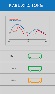
  • The real-time information was one thing working well. The participant understood the purpose at it's first glance but clicking for more information and see the graph of statistics could be more clarified as well. Using arrows are not informal enough.
The notes is very similar to the feedback we got from the evaluation during the last exercise. Our conclusion is that as our clickable prototype is quite concise in it's design and functionalities, that doing a think-aloud-evaluation would be more suitable for a prototype that includes more steps and maybe further functions to actually get an user-experience. But the purpose of the application was something the participants thought was well needed in today's commute traffic in Stockholm.

torsdag 5 november 2015

Feedback from exercise 5

From our exercise yesterday we got the following feedback:
  • Critical stops at the route, indicating the circulation of people and not just how many there are on the bus. People will also get off the bus leaving space.
  • More help support through the app, as iterating through the app is not as clear as expected.
  • Colour-blinded travelers should be considered when using color codes on the bus-icons, whether the bus is full or not.
  • Clarify the icons for the prams showing how many spots there are and available spots on the bus.
  • A suggestion of adding icons for information about the stops, for example if there's a park or area of cafés. That way, the functionality of the app also serve a better planning for the travelers by giving suggestion of what they could do if the upcoming buses is full and doesn't have any spots left for the prams.

This will be points to consider when modifying the design and the iteration process even more for the final presentation.

tisdag 3 november 2015

Hi-fi prototype


Today, we have been working on the first hi-fi prototype in Flinto. The slides are made in Illustrator and Photoshop. We started off by drawing the slides from the lo-fi in illustrator and then developed it with regard to the feedback we got from exercise 4. We added reverse buttons and made used grids make the design clearer. We also added a feature that tells the user how many strollers that are on that given bus. We use red, orange and green to communicate whether the bus is full, half full or almost empty, and the prams-icons lets the user know how many prams there are on the given bus. 


fredag 9 oktober 2015

Evaluation from another group

From the exercise 4 we also received an evaluation from another group. The feedback received was as following:

Focus group
- Apparent to who the target audience are. However, the target audience could also be for travelers with wheelchair.

Functionality
- Assuming the user will have a smart device.
- How many there are on the route real time information. One can view statistics over the general amount of travelers together with travelers with strollers.

"The Feeling"
- Users will return to the app.
- Different opinions in the group whether another step is needed or not
- Stops using the app when on the bus

Interaction & Over Arching Structure
- Reverse button from the Jarlaplan screen should be added.
- Information about how to use the app - help button/introduction
- Part of the already existing "Reseplaneraren"?

Primary & Secondary functions
- Clarify the "more information" screen
- Maybe add an alternate traveling route
- How many strollers/travelers
- The accessibility of the route

Design/Composition
- Placement about the information of the strollers should change place from the top to the bottom of the screen.
- Colours of the stroller icons is not intuitive, different patterns are not consistent
- It's not clear if one should swipe backwards
- Reverse + information button should be added
- Combine together with the app "Res i Stockholm"


Help
No, no help support is provided.

This will be notes to think about when having our next meeting to design the final Hi-Fi prototype.